How to add a funnel chart in Data Studio?
Add a community visualization to your Data Studio dashboard in 3 simple steps
FunnelGraph GA4 is here!
Use coupon code "PRESALEGA4" to secure a lifetime 25% off on monthly or annual subscriptions. Go to https://my.true-metrics.com/funnelgraph to sign-up for Premium features. Hurry up, the window will close soon!
#1 Update connector settings
By default, connector settings don't allow adding community visualizations to your dashboard. In order to use a funnel chart with the FunnelGraph connector, please enter the connector settings and activate the option "Community visualization access".


#2 Open community visualizations gallery
Now in the report inside of the toolbar you can open the modal window with "Community visualizations" by clicking on the icon right to the "Add a chart" button.
In the modal window, please click on " Explore more" in order to see the full list with options.
#3 Add funnel visualization
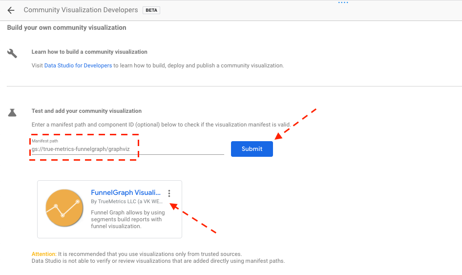
Inside of the "Community Gallery" popup window you will need to select the first option "Build your first visualization" to proceed.